
Over the centuries, maps have been distorted and none of those that are available today can give you the actual size of the countries around the world. However, courtesy of Kai Krause, you are now lucky to know the true size of Africa. Kai Krause, a software and graphic designer from Germany made a map with the aim of setting the record straight and helping people around the world realize the real sizes of different countries.
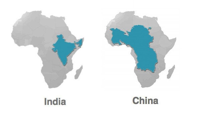
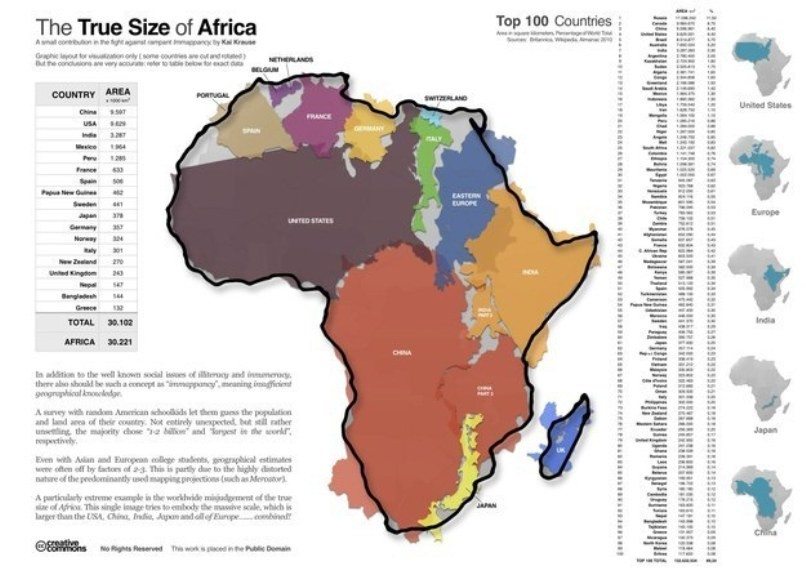
One of the most significant things his map reveals is the true size of Africa. According to the graphic designer, the true size of Africa is immensely larger than anything that has ever been portrayed in the atlases. Its actual size is like that of India, US, Japan, China and the better part of Europe combined. In fact what was presented in the Royal Geographic Society exhibition in London of unusual maps was just a mere Mercator projection. The real size is significantly larger and Kai’s map tries to show how large the continent really is.
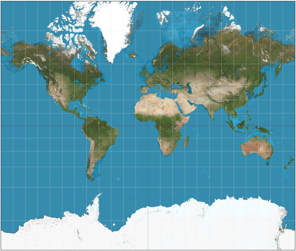
The Mercator projection was invented in 1569 by a pioneer geographer called Fleming. He made a cylindrical map projection with the aim of helping project the real size of maps. Years later, the Mercator continues to be used as the standard projector for nautical travellers. The reason it is still in use is that it can help determine the real direction of maps as well as distances.
The initial maps of Africa were drawn by colonizing Europeans and mostly concentrated on the coastlines and the interiors where these colonies resided. However, these maps left out significant parts in the interiors. Over the years, many other cartographers have come up with different maps trying to show the real size of Africa. Some of these have resulted in mixed feelings from different people claiming the maps are controversial. However, the use of Mercator made it easy to display the actual lines, boundaries and therefore the true size of the continent.
A simple change of lines in a map can cause a significant change on your fixed ideas about the geographical features of a certain region. With the use of Mercator, all lines are clearly magnified which helps the navigator estimate the actual size of a place. The ability to capture every line as it should be has made it much easier to reveal the actual size of Africa. The device clearly shows how the meridians space from each other as well as the distance between the latitudes. The device also shows that the latitudes along Africa are quite far from the equator.
See Also: The 3 African Empires That Shocked The World
Most of the maps used today do not contain all the necessary information regarding regions and places. This is because the three-dimensional map is shown on a flat two-dimensional map. As a result, there are a lot of omissions which has led to atlases and other maps showing the sizes of countries we see today. According to Krause, the use of lines instead of curves in maps leads to a lot of loss and can show a map being much smaller than it should actually be.
As Krause indicates on his website, the maps we usually see have actually cut off the real size of Africa. The Mercator, however, has been able to clear this information and show the true size of Africa. Although the Mercator has been used for decades and it has been trusted for its ability to provide actual sizes, the sizes of many maps including that of Africa has been distorted to favour some people.
Read Also: 10 Great African War Lords Who Resisted European and Arab Domination
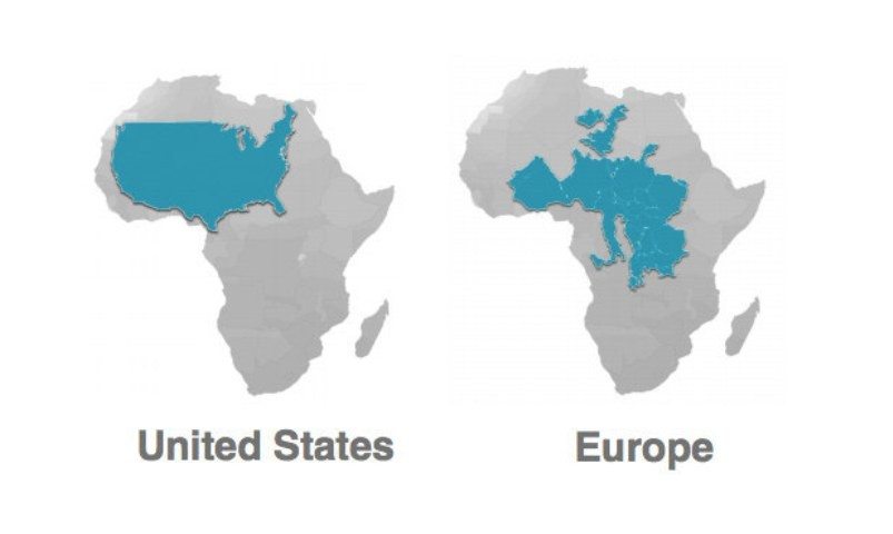
For instance, you find that the size of North America in certain maps looks larger and can actually be compared to Africa. However, the truth of the matter is that if you use the Krause map that shows the actual size of Africa, North America will fit and there will still be enough space left to accommodate India, China, Argentina and France.
Satellite maps clearly show the actual sizes of many countries, however, due to one reason or another, these maps get distorted and you therefore never get to see their actual sizes.
Krause’ website gives you access to the real map of Africa which you can easily zoom in to view different boundaries and make your own comparison between what you are used to seeing and what the real map should look like.